First published 16 February 2016

Wednesday, August 31, 2022
Tuesday, August 30, 2022
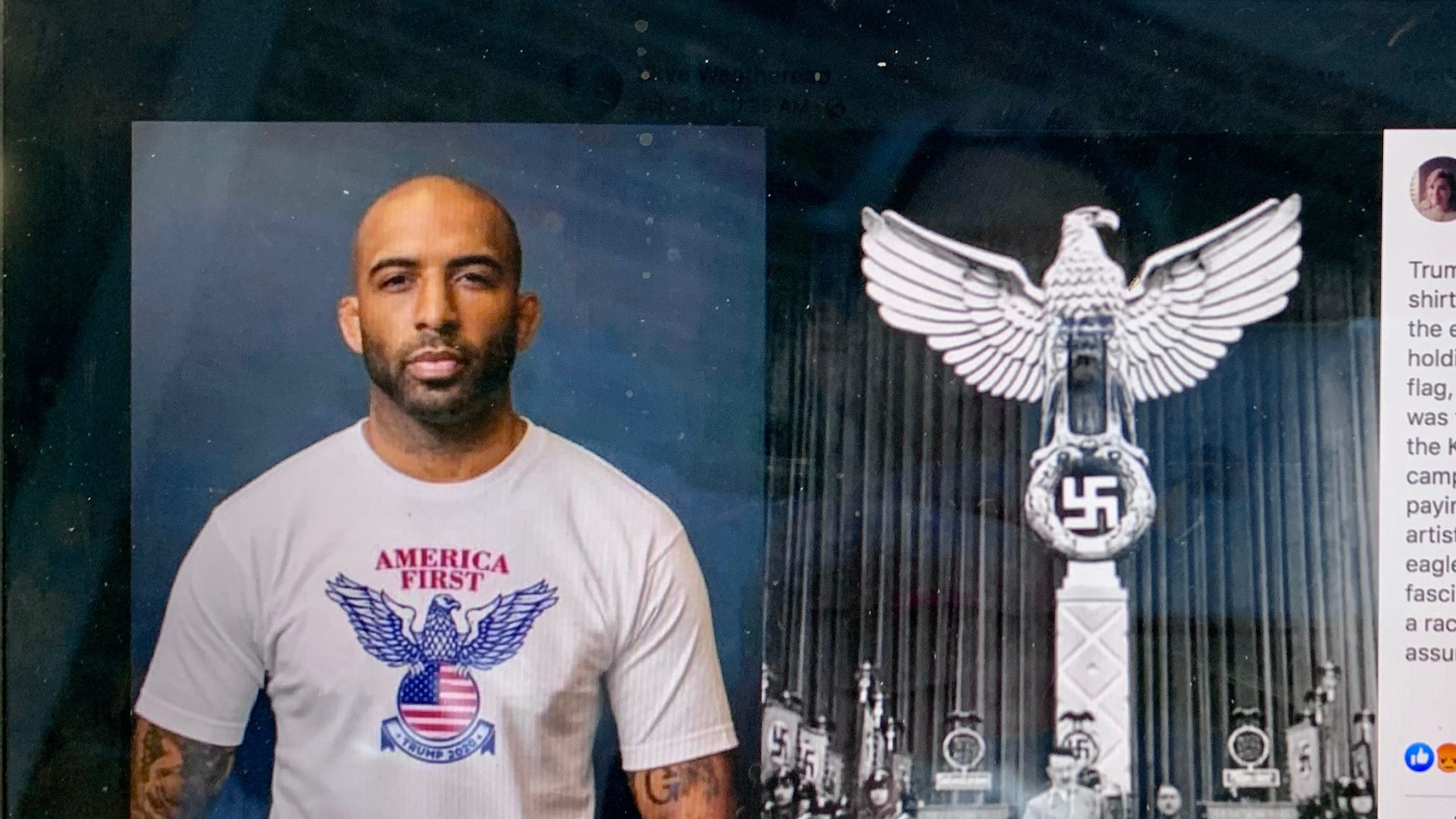
If the shirt fits....
 |
| Hmmm |
The debate over American fascism gets louder.
Analysis by Ishaan Tharoor in the August 30 Today’s WorldView newsletter of The Washington Post.
In a recent speech by Biden:
“What we’re seeing now is either the beginning or the death knell of an extreme MAGA philosophy,” Biden said, referring to Trump’s “Make America Great Again” slogan. “It’s not just Trump, it’s the entire philosophy that underpins the — I’m going to say something — it’s like semi-fascism.”
The GOP goes bonkers. In light of recent posts, it's worth a read. Tharoor notes that scholars disagree as to what fascism is, exactly. It's like we know it when we see it, but given the variety of its expression, it's hard to pin down with a precise definition.
See:
A high opinion of oneself or one's importance
See this one about CPAC using an Odal rune-shaped stage. The Odal rune being a favorite of neo-Nazis. It also mentions a Trump campaign Facebook ad using an inverted red triangle to illustrate an attack on antifa and liberal enemies. Like the yellow Star of David for Jews, the triangle was used to identify political prisoners in Nazi concentration camps.
https://lawsofsilence.blogspot.com/2021/03/oops.html
Then there was the time the Trump campaign used an image of soldiers....in Nazi-era German uniforms.
https://lawsofsilence.blogspot.com/2015/07/a-trump-is-playing-card-which-is.html
Monday, August 29, 2022
Sunday, August 28, 2022
Saturday, August 27, 2022
Friday, August 26, 2022
Monday, August 22, 2022
Star Trek: Stories

Since the Trek franchise has gone buck-wild and is currently airing 3 live-action and 2 animated series, with at least 2 more in the works, I thought it's time to publicly air an idea for a show I've been thinking about for years.
This show would not focus on a ship or a space station. It wouldn't really even be about Starfleet at all. It would be an anthology series, each episode independent of the other, with an arc in the background vaguely tying all the stories together.
There would not be any recurring characters, although a featured character in one episode could reoccur as a background character in another.
So, if not Starfleet, who would be the characters? Let's imagine a ten-episode series, like 2/3rds of the current crop (Strange New Worlds, Picard). Just off the top of my head, episodes could feature:
1. An autistic student
2. A teacher
3. A homeless person
4. An artist
5. A stay at home mom or dad
6. A robot repair person
7. A (ocean) ship's captain
8. A miner
9. A con-artist
10. An underwater archeologist (uncovering sunken Florida)
These are just ideas. Any other ten ideas could be just as valid. I was thinking it could take place on Earth, or anywhere in the Solar System. Or galaxy. But I like the idea of the long-term effects of space exploration and alien contact on the human condition.
The background story could be an impending invasion by a powerful species, a rift in space-time, a reversal of the Earth's poles, or predicted devastating solar flares. Whatever, actually. It could be meaningful, or it could be a Macguffin. This would be the background as each story played out.
The autistic kid could feature in episode one, then segue into the teacher's home life. She or he often passes a homeless person and the next episode begins when the teacher gives him or her an apple. The artist might come in as a flashback....maybe the homeless person was an artist? Who knows? One story would flow into the next based on one character's minor role in an episode. The ship captain has a reserved archeologist on board. The following episode takes place underwater as the archeologist uncovers....what, exactly?
Meanwhile, ominous PSA's warn of what to do if the sun starts shooting flames. Or how to detect space-time unraveling in your dining room, or if, if, if....
Starfleet might enter the picture, sometimes sympathetically, but maybe sometimes as self-righteous busy-bodies some characters resent. Not all main characters have to be human, and episodes could take place anywhere in the Solar System: Luna, Mars, Enceladus, Titan, Europa, Ceres.
The miner might be the stay at home dad's sister, seen briefly as a holo-mail or on a screen saying happy birthday.
The characters can be linked very tangentially, if barely at all.
Endless possibilities. Basically, no starships, Starfleet, alien battles, or great villains. Just everyday life in the Utopic future.
So, whaddya think, Trek fans? Green light this sucker and let's see what it means to busk outside a transporter pad in 24th-century Paris....
Tuesday, August 16, 2022
Refusing to Submit to the Laws of Silence
A few days ago, at the venerable and genteel Chatauqua Institution in upstate New York, Anglo/American, Indian-born author Salman Rushdie was brutally attacked as he got up to address an audience about threats to freedom of expression in the world today. Rushdie has intimate knowledge of what he speaks; he had to live in hiding for years after a fatwa and a bounty were placed on his head in response to perceived blasphemy in his novel, The Satanic Verses (1988).
In an article about Rushdie's assailant, the young man's mother says her son changed after visiting his father in Lebanon, predominantly bitter because she'd never introduced him to Islam. He became moody and quarrelsome, sleeping all day and staying awake all night.
What really struck me is that in the middle of the article, the following advertisement appeared. Was it because I'd mentioned the group in recent posts, so the ad targeted me, or is it something much more cynical?
To whit (the ad from the article in question):
 |
| Meeting Jihadists with Crusaders |
If this ad appeared because LoS recently mentioned the Templars, it's understandable, that's how algorithms work. If I Google "flights to Addis Ababa," I'd expect to see ads for flights for Adis Ababa on sites I visit.
Or maybe it's just a coincidence.
But if they're intentionally marketing Templar-themed gear in an article about about a violent attack by a young Muslim, who appears to have been motivated by an old fatwa declared by the Ayatollah Khomeini, well....wtf, no?
The Templar motif has been widely used by groups both benign and malevolent, but like so many once-noble symbols, Templar imagery has been co-opted by the far right.
"OK?"
"18?"
"Don't tread on me?"
White nationalists who have "defended" Europe from Muslim immigration are in the mix, Anders Breivik among them.
But....using the attempted murder of Rushdie to sell merchandise, symbolically pitting one religion against another? Responding to an Imam-inspired attack by marketing Templar-themed clothing, the cross staring right atcha....
It may be a coincidence. Or it may be Diabolical....
Right-wingers call Latino immigration to the US an "invasion." Some rght-wing Europeans see Muslims as the invaders. All part of the "plan" -- the "Great Replacement" -- facilitated by the European left. Which is why Breivik targeted young Socialists in his rampage that left over 70 dead. Future "replacement facilitators," I suppose. (See more on Breivik as a fake cop, fake Freemason and fake Templar....)
And young, radicalized Muslims seem all too happy to riposte to the ripostes. A "Cold Crusade," if you will. No shortage of troubled, alienated young men on both "sides" to push into the role of martyr. Who doesn't want to be a hero?
It goes without saying, LoS supports an author's right to express their ideas, and if it so happens, to offend. Just like we supported the arguably more offensive Charlie Hebdo.
We wish Mr. Rushdie a speedy recovery and commend his courage in the face of threats he received during his defense of free speech for writers in any genre, anywhere they may be. Obviously, not idle threats. Rushdie's courage in the face of danger was not something played up by clever agents and publishing marketing departments.
And courage is needed, because these things have a way of snowballing and spawning copycats: Police are already investigating a threat to J.K. Rowling after she tweeted her support for Rushdie.
Try as you might, you can't silence us all. If anything, you'll just encourage more insult and blasphemy, if only out of spite. Ponder that. I had half a mind to republish that infamous Mohammed cartoon, but I did that before, at the time it was really overheating the hookahs....Maybe I'll just film myself eating bacon off my copy of the Quran. But to be honest, I have too many Muslim friends I respect to do that. But see where the mind goes when you physically asault us? Not pleasant places to visit. There are better ways to speak up, and perhaps one of those ways is before your eyes.
By the way, the book which started this hubbub, The Satanic Verses, has, as of this writing, once again become a bestseller (number 1, in fact). A fatwa and a brutal onstage stabbing; now that's marketing! I'm gonna have my publisher put an ad on Craigslist: "Young, alienated Salafi wanted for a one-time performance, all expenses paid. To be remunerated upon completion of the job. Ice Mine author to be silenced. (Please note that given the current shortage due to fierce competition from QAnon Global Elites, 72 underage virgins cannot be guaranteed, although a spot in Paradise has already been reserved)."
I think it could work. I'll wear a bullet-proof vest and a kevlar helmet. When the bodyguard I've hired -- I know a cop from Uvalde, Texas who moonlights as private security -- subdues the attacker, we'll go down to the bar for some porkchops and beer, and start planning on how to spend the money my now-infamous novella will rake in.
Good job trying to suppress Rushdie's work, stabber-lee. You dumbass. Salamu alaykum....
.
Wednesday, August 3, 2022
Doctor Keldon Shooper presents 'Fun with Flags'
 |
| The International Federation of Vexillological Associations |
For many years now, I've done posts in which flags figure prominently; these were not really about the flags themselves, but flags as symbols of other ideas. I've thought the question to myself on many occasions, but I've never written about it:
"What makes a good flag?"
The study of flags is called vexillology. The name comes from the Latin vexillum, a square flag carried by Roman cavalry, and -logia; the Greek suffix meaning to study: meteorology, geology, astrology, etc.
There are several organizations devoted to vexillology, and the most famous vexillologist in recent memory is the fictional Sheldon Cooper, Big Bang Theory genius/autist who did a podcast called "Fun With Flags." Very "meta." The running gag is that nobody watched it. Along with rampant misogyny, the big bangers celebrated geekdom in all it's forms. I suppose vexillology is one of the geek Hydra's heads.
If my posts are any indication, I'm something of a vexillologist myself. I also love Sci-Fi. Hey-ho! I own three flags: US, Spanish, and Portuguese. I don't collect them, I just ended up with them somehow. I have always coveted a Jolly Roger though....
People get really emotional about flags. In America there is all manner of etiquette surrounding them: how they're folded (in a triangle), flown (always highest; upside down indicates SOS), stored (folded) and disposed of (ceremonially burned). Military widows (and widowers) receive them. If someone burns one in protest, it could lead to a drubbing. Constitutional amendments have been proposed to make burning one as a protest a federal offense. The 1st Amendment makes this unfeasible. Signified trumps signifier?
Flags are important. Have you seen the Civil War epic, Glory? At one point in the climactic final battle, the flag-bearer falls. All becomes chaos, the advance is halted. Then a soldier picks up the flag, waving and yelling, and the advance continues. A doomed advance as it turns out, but the importance of the flag, a standard around which men rally, is undeniable. This is actually based in fact, and flag-bearers were especially significant in the US Civil War (1860-1864).
"...as far back as Roman warfare and medieval warfare the standard-bearer had an important role on the battlefield....the standard-bearer acted as an indicator of where the position of a military unit was, with the bright, colorful standard or flag acting as a strong visual beacon to surrounding soldiers. Soldiers were typically ordered to follow and stay close to the standard or flag in order to maintain unit cohesion, and for a single commander to easily position his troops by only positioning his standard-bearer, typically with the aid of musical cues or loud verbal commands. It was an honorable position carrying a considerable risk, as a standard-bearer would be a major target for the opposing side's troops seeking to capture the standard or pull it down."
So, what makes a good flag? One supposes being easily seen, and recognizable, would be important in the context of warfare, but what else?
What follows are my opinions, some of which leading vexillologists agree with, as it turns out.
Shape-wise, the basic rectangle is best. Flags which are square (Switzerland) or doublet triangles (Nepal), or otherwise tapered and forked (Ohio, Tampa) are rarities for a reason. Nepal's flag works, and Switzerland's does as well. The shape seems to fit the nature of those countries. Ohio and Tampa, not so much. The shape does them no favors, but the colors and design are abominable. I'm from Tampa, and our flag is, well, a mess.
 |
| Switzerland |
 |
| Nepal |
.png) |
| Ohio |
 |
| Tampa |
On rare occasions, flags can work with even one color, but this is very rare. Libya's flag was just a green field until 2011. The black flag of anarchy or the red flag of communism have power because of the ideas behind them.
Two colors can be effective. The Japanese and Bangladeshi flags make it work; they are also very similar in that they have a monochromatic field with a red, stylized sun in (or offset from) the middle. Qatar's flag has always been attractive to me. A nice maroon color with a serrated white band on the left.
 |
| Japan |
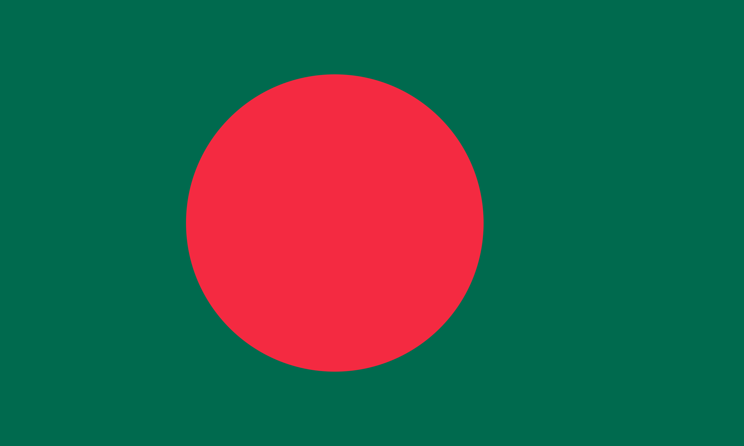 |
| Bangladesh |
.svg.png) |
| Qatar |
Personally, I think three colors work best, although there are some with more that pull it off.
Text should be avoided. Dates or slogans are useful for other parts of the national identity, but the flag is a visual medium of color and basic forms. It's not a sign. From a distance, one can't read the text anyway.
Flags should avoid overly-complex images with lots of finicky details. The aforementioned Japanese sun is a case in point. That said, the smiling sun on Argentina and Uruguay's flags work. They aren't complex per se, but instead of a circle they have faces. How cool is that? I'm not a big fan of the light blue and white color scheme of Argentina, but the sun, a whimsical fellow, makes up for it.
 |
| Argentina |
 |
| Uruguay |
Colors should be in large (-ish) swaths: vertical bands or horizontal stripes are pretty common. The French flag is simply 3 vertical stripes, and it works. Better, in my opinion, than Italy's tricolor, which uses green and not blue. It's not ugly, but just doesn't have the verve of the French. Russia and the Netherlands also have the same colors as France, but they are horizontal, and to my eye lack the force of the French "Tricolour".
.svg.png) |
| France |
 |
| Russian Federation |
 |
| The Netherlands |
France's flag is red, white and blue. Many countries use this color combo: Chile, Cuba, France, the USA, Russia, the Netherlands, Taiwan, etc. It's a good mix. Malaysia has a similar flag to the USA. Red and white stripes, blue canton in the upper-left corner. But where Old Glory has 50 stars, Malaysia has a yellow crescent moon and a single star. It's known as The Stripes of Glory. The stripes and points on the star represent the states in Malaysia, much like the US flag represents the 13 colonies and 50 states.
 |
| Malaysia |
https://www.atlasobscura.com/artlicles/we-asked-a-vexillologist-how-to-design-a-great-national-flag
This article discussed a downloadable booklet called Good Flag, Bad Flag by Ted Kaye:
https://nava.org/digital-library/design/GFBF_English.pdf
The author has 5 basic ground rules:
Flags should be simple, have meaningful symbolism, have no lettering or "busy" seals, have generally no more than three colors, and 5) either be unique....or refer to other flags with some significance for the new one.
The last rule bears citing an example. Liberia's flag is much like the US flag; it isn't unique, but it references the US flag because the country was founded as a refuge for free blacks or ex-slaves who migrated to Africa from the US. So, a new flag is either totally unique or integrates elements from the history of its people.
I pretty much picked up on Kaye's rules. I didn't discuss symbolism and I'm not sure uniqueness is required. Even the author of this pamphlet praises the French flag, which is neither unique in it's design (Italy, Belgium) nor choice of color (Russia, the Netherlands). Why does France's flag work? Good question. For me, it just does.
The US flag is simple enough, a bit busy, bit it's a works. Red, white, and blue go well together. I think Malaysia must have looked to the US, as did Liberia, logically.
Most US state flags are awful, but there a few I like: Alaska, South Carolina, and New Mexico are my top three. Rounding out a "top ten" would be Indiana, Texas, Tennessee, and since we're aiming for 10, Rhode Island, Louisiana, Maryland for being so crazy, and Arizona. I actually like the Arizona flag. It sometimes appears top-heavy, but it is a striking design, unusually-colored, but totally appropriate for the skies and rock formations of the Arizona desert. That Maryland flag sometimes strikes me as ugly, but it is unique. Most state flags are boring; so many are basically the state seal on a field of blue. And with the name of the state writ large, they break all the rules of good flag design.
 |
| Maryland |
 |
| Arizona |
 |
| New Mexicos |
This guy doesn't mince words in his video. I agree with the gist of his ranking. My biggest disagreement is his high marks for the Washington state flag. No offense Washingtonians, but that bust of George is just goofy. I like the green field but that's about it. He also places Colorado at number one. Maybe further reflection will endear me to it, but to be honest, I don't like it. I can see why people do, but I dunno. The big C is kind of cheesy. It's not a bad flag, but I honestly think dropping the C would help. I'll sleep on it.
There are a few things I wanted to query here. The first is the Principality of Sealand. Sealand is a micronation consisting of a structure built by the English during WW2. The current "Prince's" father seized it from pirate radio broadcasters in 1967 and the Prince even repelled an attack by a disgruntled ex-partner and a group of mercenaries in 1978. Like many of these self-proclaimed nations, they issue currency, stamps and ID cards to collectors. Apparently, they once had a serious business offer as a secure data-haven.
Do they have a website? Of course they do. I think Sealand raises interesting and legitimate questions about what constitutes a nation. And by what right. Possession being 9/10ths of the law and all that. Heck, why does the Catholic Church have a state? Why is the President of France co-prince of Andorra, along with the bishop of Oviedo? Or some Spanish Bishopric. Look it up.
From a vexillological point of view, is their flag a success? I like it, but would like it better if the red and black were of equal proportion. The Red and the Black. Perhaps my fondness for Stendahl predisposes me to like it.
The colors are also those of Nazi Germany's flag. I include it here, along with that of the Confederate States of America, because I think from a design point of view, they are effective flags. The problem with that assessment is self-evident. Or should be. Can we appreciate a flag or a design separately from what it represents? The Marseillaise, the French national anthem, is rousing. But it speaks of irrigating French fields with the blood of it's enemies.
The Nazi flag represents an odious ideology. Genocidal bigotry. The Confederate Battle Flag represents the fight to preserve slavery. I look at them and can't help but think of what they represent. But part of me has to admit that they are well-designed and follow Kaye's 5 rules. Perhaps this is why the battle flag persists as a symbol of the South, whereas the actual national flag of the CSA is all but forgotten.
It strikes me that perhaps I've become too amoral trying to be "objective." Is it normal I can look at the Nazi flag and admire the design? It's not that I forget what it represents, just that I think it's powerful. It also occurs to me that the "power" isn't in the design at all, but in the actions performed in its shadow. There must be some semiotic falderal about signifier and signified to delve into here, but I'm just not that clever.
Ancillary questions: Can we admire Pound's poetry knowing he was a fascist? Can we admire Coco Chanel knowing she cavorted with Nazis? What about H.P. Lovecraft? He was racist and antisemitic even by the standards of his time. And Polanski sodomized a 13-year-old with a champagne bottle. I still enjoy Fearless Vampire Killers....
I don't mean to be flip or dismissive. I think it's a legitimate aesthetic issue; how much can we separate a design from what it symbolizes?
Thoughts?
 |
| Sealand |
.svg.png) |
| Nazi Germany |
 |
| The Confederate States of America |
I know that puts me at odds with many. I'm not trying to sneak in some nastiness under the guise of vexillology. It's just a an ethical and aesthetic question I've pondered for a long time. I wonder what Kaye would say....?
Subscribe to:
Posts (Atom)