Showing posts with label vexillology. Show all posts

Tuesday, December 26, 2023

It's always sunny in Kazakhstan


It's It's been a while, but because we're a) into flags, b) into suns, and c) into numbers associated with Freemasonry, we thought we'd take a gander at the flag of Kazakhstan.

The flag adheres to the basic "rules" of good flag design: not too many colors (2 or 3), meaningful symbolism, no seals or writing, simplicity, and uniqueness.

One might argue the vertical band to the left is an unnecessary complication, but I don't think so, because it's a typical pattern of Kazakhstan.  That said, I could see the flag without the design and not "losing" anything.  The band was originally red, and changing it to yellow was a good decision.

The design of the sun is not like the Argentine/Uruguay type but more like that of Taiwan or Namibia, in that the rays are triangles detached from the circle.   And there are 32 of them. These 32 rays are said to represent the stages of grain development, but I always geek out on the Masonic use of this number.  There are 32 degrees in the Scottish Rite, or 33 if we count the ultimate, honorary degree.  The Rite is also, it so happens, to be symbolized by an eagle.

When I learned about this,. I didn't think it was an intentional Masonic message wink to those on the level.  A 32-rayed sun?  Coincidence.

Here's Wikipedia on the flag's symbolism.  No Masonry mentioned:

....The pattern represents the art and cultural traditions of the old Khanate and the Kazakh people. The turquoise background symbolises the peace, freedom, cultural, and ethnic unity of Kazakh people including the various Turkic people that make up the present-day population such as the Kazakhs, Tatars, Uyghurs, Uzbeks, as well as the significant Indo-European peoples. The sun represents a source of life and energy. It is also a symbol of wealth and abundance; the sun's rays are a symbol of the steppe's grain which is the basis of abundance and prosperity.

People of different Kazakh tribes had the golden eagle on their flags for centuries. The eagle symbolises the power of the state. For the modern nation of Kazakhstan the eagle is a symbol of independence, freedom and flight to the future.

So, there you go.  The end.  And then....

I was about to put this to bed and then decided to Google  "masonry and Kazakhstan."   What resulted surprised me. Apparently the capital city, created pretty much from scratch, is considered to be rife with occult and Masonic symbolism in it's architecture, parks, and monuments, including pyramids, towers, 32 symbolism, pentagrams, an owls.  Hoo boy, this place has it all.  I have a lot to unpack here; it's not so much a rabbit hole as a full-on warren. Gonna need to dig into this and get back atcha.

Until then, check out this link.  Don't know if I can add much more, and it's just so much to deal with!

Link

Monday, December 25, 2023

Salaam Alaikum, Minnesota!

Effective May 11, 2024

I just looked into this story after seeing a post about it on Facebook.  Minnesota has chosen a new flag. It's a decent flag in my opinion, and better than any of the five other finalists that the redesign commission had chosen. Problematic cultural issues aside, which are by far enough to merit a redesign, the old flag was just an aesthetic mess. It was not only ugly and indistinguishable from any number of similar state flags, it managed to be both busy and boring.  

The outgoing flag, 1957 revision 

So, good on Minnesota for changing it.  Now the state has a distinct, striking, and streamlined flag.  Ted Kaye, who literally wrote the book on flag design, gives it an A+.

Kaye, of the North American Vexillological Association, considers it to be one of the ten best US state flags.  A far cry from 2001, when the same Association named the previous flag one of the ten worst.   If I recall correctly, the old flag breaks at least 4 of Kaye's rules for effective flag design (it does).

Critics of the new flag are crying foul, saying it's wokeism run amok.  Some even claim it represents a kind of Somali "takeover" of Minnesota, because of a perceived likeness to the flag of Jubaland.  Jubaland is a part of Somalia, and Minneapolis has a large Somali community, the largest outside of Somalia; when I called the High School in Minneapolis, where my son did a year abroad, one could continue one's call in Somali. 

Talk of takeover and nativist, "great replacement" fear-mongering is ironic, because the old flag literally depicted the actual historical takeover of what is now Minnesota from the Native Americans....an Indian rides away as Sven sews his newly stolen fields...

Flag of Jubaland, home of Minnesota's new overlords

But like removing confederate imagery from southern states' flags, it's time; our  political symbols must reflect, respect, and represent all of our citizens. And man, the old flag was an eyesore. I can't imagine anyone actually being proud of it. Time will tell for the new one, but at least they've given the people something to work with.

Saturday, September 24, 2022

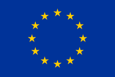
Europa, Europa, Europa, Europa, Europa, Europa, Europa, Europa, Europa, Europa, Europa, Europa

 A.


B.


C.


The Flag of a US Foreign Service Officer
13 stars with jaunty alternating positions....


D.


12 hours on a clock (often IIII not IV but IX, BTW)
12 months in a year 
12 symbols of the zodiac 
12 Apostles 
12 sons of Jacob 
12 semitones in an octave (western music)
12 days of Christmas
12 Caesars chronicled by Suetonius
12 Olympian gods
12 labors of Hercules
12 tables of Roman Law
12 Hues in the color wheel, star or sphere (western art)

Friday, September 23, 2022

Vexillological Oddities

        
This is the last flag post for a while, promise........


I wouldn't call most of the flags on this list "scary"....although some are quite odd.  A couple are vaguely creepy.  I think some are beautiful....

Up top's a sample from the Kingdom of Benin:  A naked guy decapitating another naked guy, hey hey!  It doesn't matter that the actual provenance or use of this flag is not entirely certain, it's a great flag.  The name of the file is actually "unidentified West African Flag."

Wiki

"The 'flag of the Kingdom of Benin' is an unidentified West African flag that was brought to Britain after the Benin Expedition of 1897 against the Kingdom of Benin.  Debate exists over the origin of the flag, including which West African people created it."

See me wave....

The National Maritime Museum (UK) says the flag is "probably" Itsekri in origin.  By comparison, the flag pictured below is contemporary and used to represent the Itsekri people.  Perhaps the swords
, and the red and white color scheme, led experts to attribute a Beninois origin to our "mystery flag?"  

The Itsekri are related to the Yoruba and both groups are concentrated in present-day Nigeria, which borders present-day Benin.  The historical Kingdom of Benin was actually within what is now Nigeria and was not the precursor of the modern state that bears its name, which was, until 1975, known as Dahomey.

What the flag refers to, historically or allegorically, I don't know.  Maybe a Cain and Abel-type situation?  Or Romulus and Remus.  Some kind of fratricide....a civil or tribal conflict perhaps? 


....A red wool bunting flag with a linen hoist, machine sewn (italics added) with a rope halyard attached. The design is applied in white fabric with painted details....said to have been brought back by Admiral F. W. Kennedy from the 1897 Benin expedition. 'Kennedy' is inscribed on a paper label attached to the rope.

The Itsekri people acted as middle men between the Edo people....in the interior and the Europeans on the coast - the Edo would not cross or travel on waterways.

The Benin expedition was launched in reprisal against an attack on a British mission in the service of Niger Coast Protectorate by forces of the Oba of Benin....The towns of Guato and Sapobar were attacked by detached forces while the main part of the expedition marched on Benin. The town was captured and accidentally burnt....The famous Benin bronzes were removed as reparations stolen by the British.

National Geographic reports that the Kingdom flourished between 1200 and 1800 CE, and that human sacrifice was practiced there to honor its kings.  Could the flag reflect the practice of ritual beheading?  Could be; one visitor in 1838 was especially "disgusted by the sight of turkey-buzzards feeding on the carcasses of the beheaded."  Referring to sacrificed victims.  (see The Slave Trade, Depopulation and Human Sacrifice in Benin History, James D. Graham in Cahiers d'Études africaines (1965).

Maybe the flag was a gift to Kennedy for his role in "decapitating" the Kingdom of Benin?  Regime change and all that.  The Kings of Benin did have their excesses.

(Note that historians say reports of human sacrifice in Benin were exaggerated and that the actual practice was limited in scope; some evidence suggests those "sacrificed" were in fact condemned criminals.  No finger-wagging now.  Executions in 13th-century London were more brutal than what is suspected to have occurred in Benin -- 75,000 executions during the 38-year reign of Henry VIII alone....)  

In the US we can inject, shoot, hang, asphyxiate or burn our condemned prisoners alive.  Freedom of choice.  Just for perspective.  And if you think an injection is humane, bear in mind that "Lethal injection causes severe pain and severe respiratory distress with associated sensations of drowning, asphyxiation, panic, and terror in the overwhelming majority of cases."  Winning!

Here's yet another Kennedy associated with a head wound...and some etymologies have the name Kennedy itself deriving from a Gaelic word for...."head."  Of course, let's not forget Hoffman and Downard's King-Kill-33, the seminal conspiratorial text positing that the assassination of JFK was a ritual psychodrama, a "killing of the king" by shadowy Masonic forces....as part of their ongoing plan to usher in a "new order for the the ages."

Anyway, this Benin flag is just one of many curiosities on the list, and it's a fun read.  Flags, like coins, are great Ports of Entry into History.  I for one am digging these forays into vexillology and since you're reading (or not), I hope you are too.

By Thingsomyipisntvisable - Own work, CC BY-SA 4.0, https://commons.wikimedia.org/w/index.php?curid=116797073

Thursday, September 22, 2022

Oh, Toulouse!

Out with the old....

In with the new....

Toulouse.  "La Ville Rose," legendary rugby town, birthplace of Claude Nougaro and Carlos Gardel (maybe).  Zebda, Bigflo & Oli, The Fabulous Trobadors....


Toulouse.  Known for its vibrant hip-hop and graffiti scenes.  I just grokked a (Space) Invader piece earlier today, glued to the wall of the Café des Artistes, hehe.  Ate lunch at my son's flat, haha -- we called my 1st apartment the "flat sun" -- on a narrow street (rue Gramat) with facades covered from cobblestones to eaves with big works of graffiti.  Local rap collective La Dalle (The Hunger) filmed their video for their song Insatiable at the lad's "trap."  

"Get the hip-hop vinyls, Scarface and Halloween posters in the background...." 

"I got Scarface on RE-peat!"  Hey maig'n, I cain't hep it if'n I'm frum Tampa...."

If you look close enough you'll see one of those Dalle blighters wearing my HS class ring


Toulouse.  On the rue Gramat, elderly couples walk by with cameras, digging what's fresh.  Classes of lycéens sit and take notes as teachers explain the "graf."  The dealers sit perched at either end to sell off-the-truck smokes or "shit"--and it is shit--what they call hash here in France....all of it seems to work.

Untranslated articles, but the quantity alone indicates the little street's fame:

Rue Gramat (Wikipedia.fr)
La rue Gramat : des fresques vivantes et pleines d’histoire (Le 24 Heures) (Lively Frescos full of History)
Pourquoi la rue Gramat est-elle recouverte de graffs ? (Le Journal Toulousain) (Why is the rue Gramat covered in graffiti?)
Toulouse. Graff : la rue Gramat prend les couleurs de la paix (La Depêche) (Rue Gramat takes on the colors of Peace)

Toulouse.  A student town:  tolerant, diverse, bustling, working-class.  My home for 20+ years (most importantly, natch.  Croix-Daurade (The Gilded Cross), La Daurade (Eldorado), Côte Pavé (The Paved Slope....?)....Tolerant of gypsies, Cathars, soothtsayers, Jews, the homeless and the itinerant back in the Middle Ages, and still pretty tolerant today.  Early memory:  Hanging out in a speakeasy in the basement of a "hairdresser's."  We're watching the owner negotiate for a rack of off-the-truck shirts.  Me, 5 Ghanaian dudes, and a transvestite prostitute, .  A comely lass; 'tis a pity she was a whore, but she was cool.  No Bowiesque punch-ups...."like a dude...."

So, according to Kaye's 5 rules of vexillology, which Toulouse flag is better, the old (top) or the new (bottom)?  There actually is a right answer.

In your opinion, which one is better?

I'll say this:  remove the out-of-place kow-tow -- the obsequious curtsey -- to the fleur-de-lis weighing down the old city flag and you'd already improve it by a factor of appx. 92.2733 %.  Unless the market is depressed that year.

Wednesday, September 21, 2022

They were the best of flags, they were the worst of flags....


This is a link to one writer's list of the best and worst of America's city flags. I don't agree with her "best" choices, but the "worst" flags are just awful.

I don't think she got the memo, because some of her "good" examples don't respect the vexillological standards of what constitutes a good flag.  Not using text (mottos, city names, etc.) or reproducing "busy" city seals, for example.  

Does it matter?  I for one am all for finding exceptions, and these "rules" are more like aesthetic guidelines.  The 5 rules are actually self-evident, once you've read them.  They confirm my inkling that genius is often merely stating the obvious in simple terms, about things which only become obvious after the stating.  We all knew it, somehow, but we just weren't aware we knew.  And like apes to space shuttles in terms of the distance twixt having a vague grunt of recognition and an actual articulation....

Indeed, the flags she likes which use text would indeed be much more effective without it!  Indeed.  Did I mention indeed?)

(Those 5 "rules" were enunciated by Ted Kaye in Good Flag, Bad Flag, legally and happily downloadable here.  The pamphlet is based upon the compiled wisdom of 20-odd leading vexillologists).

BTW, Milwaukee, your trainwreck of a city flag may just outdo that of my hometown, Tampa, in terms of garish suckiness.  But take heart!  Yours may not even be the worst in the list.  Provo?  Jesus wept.*

Enjoy this humorous TED Talk about American cities' flag problem.

Wednesday, August 3, 2022

Doctor Keldon Shooper presents 'Fun with Flags'

The International Federation of Vexillological Associations

For many years now, I've done posts in which flags figure prominently; these were not really about the flags themselves, but flags as symbols of other ideas.  I've thought the question to myself on many occasions, but I've never written about it: 

"What makes a good flag?"

The study of flags is called vexillology.  The name comes from the Latin vexillum, a square flag carried by Roman cavalry, and -logia; the Greek suffix meaning to study: meteorology, geology, astrology, etc. 

There are several organizations devoted to vexillology, and the most famous vexillologist in recent memory is the fictional Sheldon Cooper, Big Bang Theory genius/autist who did a podcast called "Fun With Flags."  Very "meta."  The running gag is that nobody watched it.  Along with rampant misogyny, the big bangers celebrated geekdom in all it's forms.  I suppose vexillology is one of the geek Hydra's heads.

If my posts are any indication, I'm something of a vexillologist myself.  I also love Sci-Fi.  Hey-ho!  I own three flags:  US, Spanish, and Portuguese.  I don't collect them, I just ended up with them somehow.  I have always coveted a Jolly Roger though....

People get really emotional about flags.  In America there is all manner of etiquette surrounding them: how they're folded (in a triangle), flown (always highest; upside down indicates SOS), stored (folded) and disposed of (ceremonially burned).  Military widows (and widowers) receive them.  If someone burns one in protest, it could lead to a drubbing.  Constitutional amendments have been proposed to make burning one as a protest a federal offense.  The 1st Amendment makes this unfeasible.  Signified trumps signifier?

Flags are important.  Have you seen the Civil War epic, Glory?  At one point in the climactic final battle, the flag-bearer falls.  All becomes chaos, the advance is halted.  Then a soldier picks up the flag, waving and yelling, and the advance continues.  A doomed advance as it turns out, but the importance of the flag, a standard around which men rally, is undeniable.  This is actually based in fact, and flag-bearers were especially significant in the US Civil War (1860-1864). 

Sayeth Wiki:

"...as far back as Roman warfare and medieval warfare the standard-bearer had an important role on the battlefield....the standard-bearer acted as an indicator of where the position of a military unit was, with the bright, colorful standard or flag acting as a strong visual beacon to surrounding soldiers. Soldiers were typically ordered to follow and stay close to the standard or flag in order to maintain unit cohesion, and for a single commander to easily position his troops by only positioning his standard-bearer, typically with the aid of musical cues or loud verbal commands. It was an honorable position carrying a considerable risk, as a standard-bearer would be a major target for the opposing side's troops seeking to capture the standard or pull it down."

So, what makes a good flag?  One supposes being easily seen,  and recognizable, would be important in the context of warfare, but what else?  

What follows are my opinions, some of which leading vexillologists agree with, as it turns out.

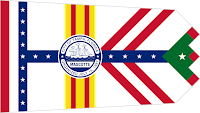
Shape-wise, the basic rectangle is best. Flags which are square (Switzerland) or doublet triangles (Nepal), or otherwise tapered and forked (Ohio, Tampa) are rarities for a reason. Nepal's flag works, and Switzerland's does as well.  The shape seems to fit the nature of those countries.  Ohio and Tampa, not so much.  The shape does them no favors, but the colors and design are abominable.  I'm from Tampa, and our flag is, well, a mess.

Switzerland 

Nepal

Ohio

Tampa 

On rare occasions, flags can work with even one color, but this is very rare. Libya's flag was just a green field until 2011.  The black flag of anarchy or the red flag of communism have power because of the ideas behind them.

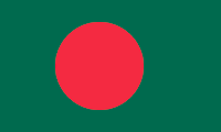
Two colors can be effective. The Japanese and Bangladeshi flags make it work; they are also very similar in that they have a monochromatic field with a red, stylized sun in (or offset from) the middle. Qatar's flag has always been attractive to me.  A nice maroon color with a serrated white band on the left.

Japan

Bangladesh 

Qatar

Personally, I think three colors work best, although there are some with more that pull it off.

Text should be avoided. Dates or slogans are useful for other parts of the national identity, but the flag is a visual medium of color and basic forms.  It's not a sign.  From a distance, one can't read the text anyway.

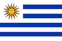
Flags should avoid overly-complex images with lots of finicky details.  The aforementioned Japanese sun is a case in point. That said, the smiling sun on Argentina and Uruguay's flags work.  They aren't complex per se, but instead of a circle they have faces.  How cool is that?  I'm not a big fan of the light blue and white color scheme of Argentina, but the sun, a whimsical fellow, makes up for it.
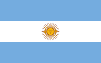
Argentina

Uruguay 

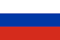
Colors should be in large (-ish) swaths: vertical bands or horizontal stripes are pretty common.  The French flag is simply 3 vertical stripes, and it works.  Better, in my opinion, than Italy's tricolor, which uses green and not blue.  It's not ugly, but just doesn't have the verve of the French.  Russia and the Netherlands also have the same colors as France, but they are horizontal, and to my eye lack the force of the French "Tricolour". 

France

Russian Federation 

The Netherlands 

France's flag is red, white and blue.  Many countries use this color combo: Chile, Cuba, France, the USA, Russia, the Netherlands, Taiwan, etc.  It's a good mix.  Malaysia has a similar flag to the USA. Red and white stripes, blue canton in the upper-left corner.  But where Old Glory has 50 stars, Malaysia has a yellow crescent moon and a single star. It's known as The Stripes of Glory.  The stripes and points on the star represent the states in Malaysia, much like the US flag represents the 13 colonies and 50 states.
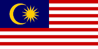
Malaysia 

So, I wrote the text above, then Googled the query, "What makes a good flag?" and landed here:

https://www.atlasobscura.com/artlicles/we-asked-a-vexillologist-how-to-design-a-great-national-flag

This article discussed a downloadable booklet called Good Flag, Bad Flag by Ted Kaye:

https://nava.org/digital-library/design/GFBF_English.pdf

The author has 5 basic ground rules:

Flags should be simple, have meaningful symbolism, have no lettering or "busy" seals, have generally no more than three colors, and 5) either be unique....or refer to other flags with some significance for the new one.  

The last rule bears citing an example. Liberia's flag is much like the US flag; it isn't unique, but it references the US flag because the country was founded as a refuge for free blacks or ex-slaves who migrated to Africa from the US.  So, a new flag is either totally unique or integrates elements from the history of its people.

I pretty much picked up on Kaye's rules.  I didn't discuss symbolism and I'm not sure uniqueness is required. Even the author of this pamphlet praises the French flag, which is neither unique in it's design (Italy, Belgium) nor choice of color (Russia, the Netherlands).  Why does France's flag work?  Good question. For me, it just does.

The US flag is simple enough, a bit busy, bit it's a works. Red, white, and blue go well together.  I think Malaysia must have looked to the US, as did Liberia, logically.

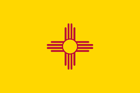
Most US state flags are awful, but there a few I like: Alaska, South Carolina, and New Mexico are my top three.  Rounding out a "top ten" would be Indiana, Texas, Tennessee, and since we're aiming for 10, Rhode Island, Louisiana, Maryland for being so crazy, and Arizona.  I actually like the Arizona flag.  It sometimes appears top-heavy, but it is a striking design, unusually-colored, but totally appropriate for the skies and rock formations of the Arizona desert.  That Maryland flag sometimes strikes me as ugly, but it is unique.  Most state flags are boring; so many are basically the state seal on a field of blue.  And with the name of the state writ large, they break all the rules of good flag design.

Maryland

Arizona

New Mexicos 

This guy doesn't mince words in his video. I agree with the gist of his ranking.  My biggest disagreement is his high marks for the Washington state flag.  No offense Washingtonians, but that bust of George is just goofy.  I like the green field but that's about it.  He also places Colorado at number one.  Maybe further reflection will endear me to it, but to be honest, I don't like it.  I can see why people do, but I dunno.  The big C is kind of cheesy.  It's not a bad flag, but I honestly think dropping the C would help.  I'll sleep on it.

There are a few things I wanted to query here. The first is the Principality of Sealand.  Sealand is a micronation consisting of a structure built by the English during WW2.  The current "Prince's" father seized it from pirate radio broadcasters in 1967 and the Prince even repelled an attack by a disgruntled ex-partner and a group of mercenaries in 1978.  Like many of these self-proclaimed nations, they issue currency, stamps and ID cards to collectors.  Apparently, they once had a serious business offer as a secure data-haven.  

Do they have a website? Of course they do.  I think Sealand raises interesting and legitimate questions about what constitutes a nation. And by what right.  Possession being 9/10ths of the law and all that.  Heck, why does the Catholic Church have a state?  Why is the President of France co-prince of Andorra, along with the bishop of Oviedo?  Or some Spanish Bishopric.  Look it up.

From a vexillological point of view, is their flag a success?  I like it, but would like it better if the red and black were of equal proportion.  The Red and the Black.  Perhaps my fondness for Stendahl predisposes me to like it.

The colors are also those of Nazi Germany's flag.  I include it here, along with that of the Confederate States of America, because I think from a design point of view, they are effective flags.  The problem with that assessment is self-evident.  Or should be.  Can we appreciate a flag or a design separately from what it represents?  The Marseillaise, the French national anthem, is rousing.  But it speaks of irrigating French fields with the blood of it's enemies.  

The Nazi flag represents an odious ideology.  Genocidal bigotry.  The Confederate Battle Flag represents the fight to preserve slavery.  I look at them and can't help but think of what they represent.  But part of me has to admit that they are well-designed and follow Kaye's 5 rules.  Perhaps this is why the battle flag persists as a symbol of the South, whereas the actual national flag of the CSA is all but forgotten.

It strikes me that perhaps I've become too amoral trying to be "objective."  Is it normal I can look at the Nazi flag and admire the design?  It's not that I forget what it represents, just that I think it's powerful.  It also occurs to me that the "power" isn't in the design at all, but in the actions performed in its shadow.  There must be some semiotic falderal about signifier and signified to delve into here, but I'm just not that clever.

Ancillary questions:  Can we admire Pound's poetry knowing he was a fascist?  Can we admire Coco Chanel knowing she cavorted with Nazis?  What about H.P. Lovecraft?  He was racist and antisemitic even by the standards of his time.  And Polanski sodomized a 13-year-old with a champagne bottle.  I still enjoy Fearless Vampire Killers....

I don't mean to be flip or dismissive.  I think it's a legitimate aesthetic issue; how much can we separate a design from what it symbolizes?

Thoughts?

Sealand

Nazi Germany

The Confederate States of America 

I know that puts me at odds with many.  I'm not trying to sneak in some nastiness under the guise of vexillology.  It's just a an ethical and aesthetic question I've pondered for a long time.  I wonder what Kaye would say....?

Friday, July 29, 2022

The Random Sun

At the supermarket, stuck for ideas, I asked the woman at the register to give me a random word.  She said "Soleil."  Sun.  The Sun and political imagery came to mind:  Obama's rising sun logo.  The Japanese flag.  The Sun King.

Then I Googled "national flags with the sun".  I knew The Philippines and Argentina would pop up, but I wasn't familiar with Namibia's flag until today.  When I saw it  (adopted, 1990), I was surprised, because the sun in the upper left Canton is a 12-pointed version stylized almost exactly like that of the Taiwanese flag, which I'd seen when looking into the brief life of the Chinese fascist "Blueshirts."  Dig:

The colors are different.  The Taiwanese rays are longer and completely unattached, but the angles at the base of each isosceles ray of the Namibia flag touch slightly.

At first glance they are almost identical.  Both have 12 rays and are set against a blue field.  Curious that they are stylized in such a similar fashion.

I won't recap the 10+ years of sun imagery and metaphor we've discussed here on LoS, but it seems worth discussing the similarities between these two flags. 

According to the Namibia government website:

The sun symbolises life and energy. The golden colour of the sun represents the warmth and the colour of the plains of the Namib Desert.

The blue symbolises the sky, the Atlantic Ocean, Namibia’s marine resources and the importance of rain and water.

Red represents the Namibian people, their heroism and their determination to build a future of equal opportunity for all.

White refers to peace and unity.

The green symbolises the country’s vegetation and agricultural resources.

No reason why there are 12 rays.

On Taiwan's flag....The twelve rays of the white Sun symbolize the twelve months and the twelve traditional shichen (時辰; shíchén), a traditional unit of time which corresponds to two modern hours. Sun Yat-sen added the "Red Earth" to the flag to signify the blood of the revolutionaries who sacrificed themselves in order to overthrow the Qing Dynasty and create the ROC. Together, the three colours of the flag correspond to the Three Principles of the People: Blue represents nationalism and liberty; White represents democracy and equality; and Red represents the people's livelihood and fraternity.

The explanation for the colors, although not exactly the same, is very similar.  I hadn't really noted that Taiwan's flag is red, white, and blue.  Common flag colors:. USA, France, Russia, the Netherlands, Cuba, Chile, the UK....

Other national flags feature the sun: Argentina and Uruguay, the Philippines....here's a complete list.  

We've looked at some flags with single stars and some with constellations.  I don't think we've looked at any with the moon.  I suppose most of these would be the crescent moon of Islam, although South Carolina is an obvious exception 

....

Coming up next, or in short order, anyway.  Sun, stars, constellations, and soon, the moon....